

Colour Themed & Outfits

How to coordinate your decor and your attire for a wedding
You may have spent countless hours creating the perfect wedding dress or suit. You may have also spent thousands of rupees on decorating your wedding venue. And, if you hired a florist, you likely selected the most beautiful flowers available.
However, does all of this come together in a way that truly works in a single photo? When it comes to coordinating your wedding outfit with your decor, the answer is "yes." Coordinating your wedding outfit with your decor does not mean using the same colour for every aspect of your wedding. Using the same colour throughout the wedding can make the decor look boring and can cause the couple to disappear into the background of the decor.
The goal of colour coordination is to establish a visual connection between your outfits, decor, and florals,while allowing the couple to remain at the forefront of the event.
However, if you already know what you wish to wear for your wedding, designing your attire first can provide a beneficial starting point.
Your lehenga, saree or gown may already contain multiple colours due to embroidery, borders, embellishments or patterns. Rather than attempting to introduce ten different colours into your decor, determine the predominant colour and two additional colours that support that colour. As an example, consider a bride who is wearing a rich wine-coloured lehenga with antique gold embroidery and touches of blush.

Although the decor does not need to be entirely wine and gold, you can incorporate a softer blush or dusty rose as the primary colour for your décor.
Additionally, you can utilize warm ivory as the foundation for your decor, gold as an accent colour, and greenery or muted flowers to provide contrast.
Ultimately, these elements create a sense of unity without appearing to be carbon copies. Wedding colour schemes are most effective when they establish a visual theme that provides direction for flowers, linen, rental items and other décor elements.
Ultimately, the objective is to develop enough similarity among the elements so they appear to fit together, but also enough difference among them so each element remains distinct.

Develop a three-layered approach: Foundation, Supporting, and Accent color
An easy way to develop a wedding colour scheme is to divide it into three levels:
1. Foundation Color: This establishes the overall mood/atmosphere. Examples include ivory, beige, champagne, blush, pale blue, sage or warm white.
2. Supporting Color: This provides individuality and connects the primary visual components. Examples include dusty pink, lavender, peach, terracotta, emerald or muted yellow.
3. Accent Color: This should be utilized sparingly. Gold, silver, wine, deep green, royal blue or a bright pink can appear through flowers, cushions, stationery, embroidery, table details or accessories.
In fact, different functions can possess unique personalities while still being perceived as part of the same wedding.
Haldi
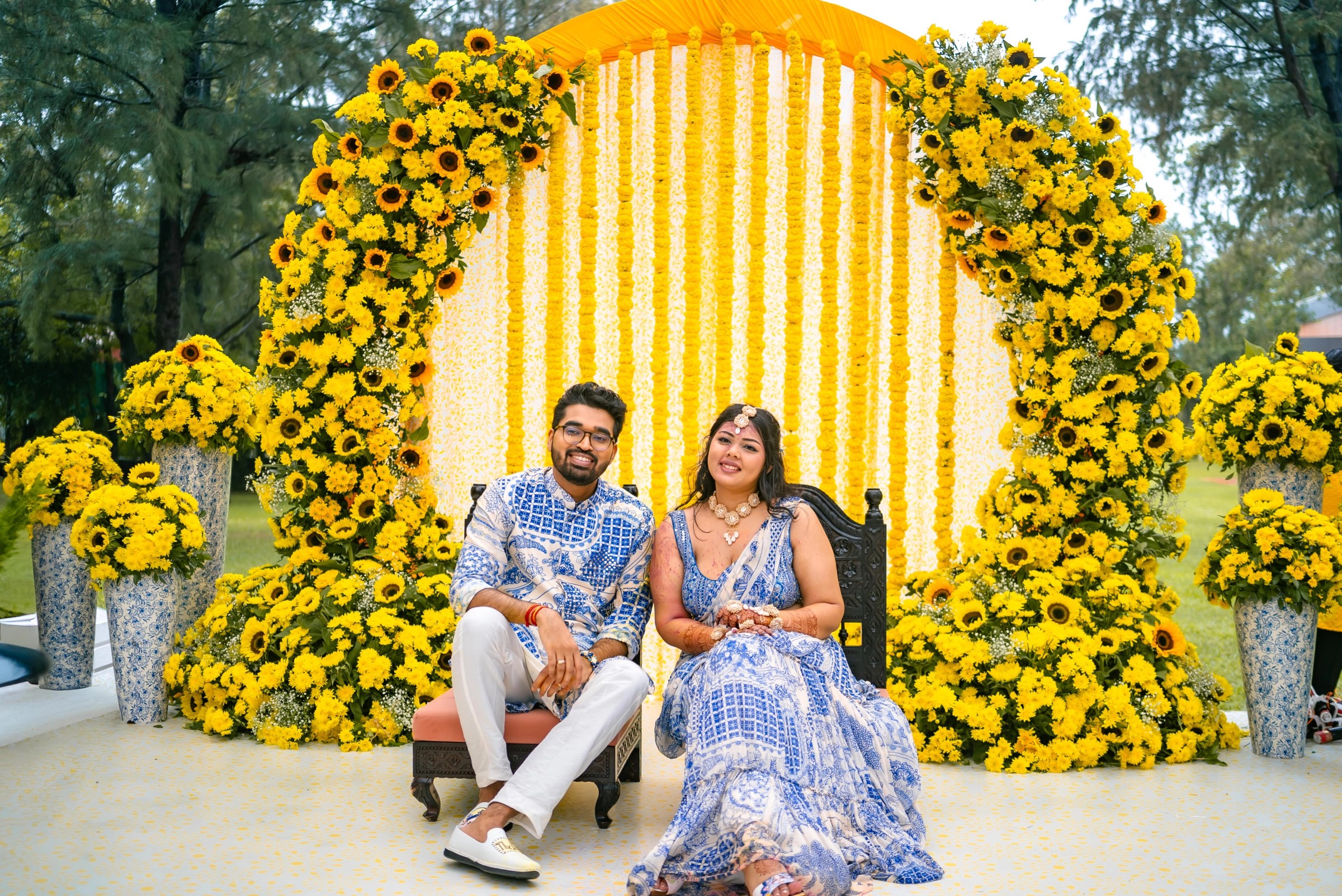
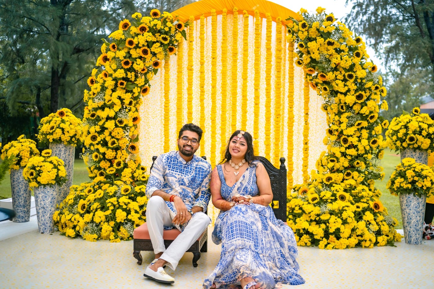
Haldi inherently lends itself to bright, lively colours. Think marigold yellow, turmeric yellow, orange, green, peach or pink. If the bride is wearing a bright yellow outfit, you can use lighter-coloured florals and contrasting foliage rather than covering the entire space in yellow.
Mehendi
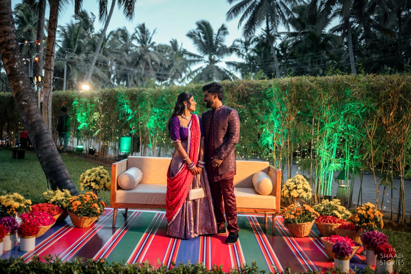
Mehendi allows you greater flexibility to experiment with your colour scheme. Green, pink, orange, yellow, peach and vibrant floral arrangements can create a playful atmosphere. If the bride is wearing a heavily patterned outfit, consider keeping the majority of the backdrops relatively simple and adding colour through floral arrangements and smaller installations.
Sangeet
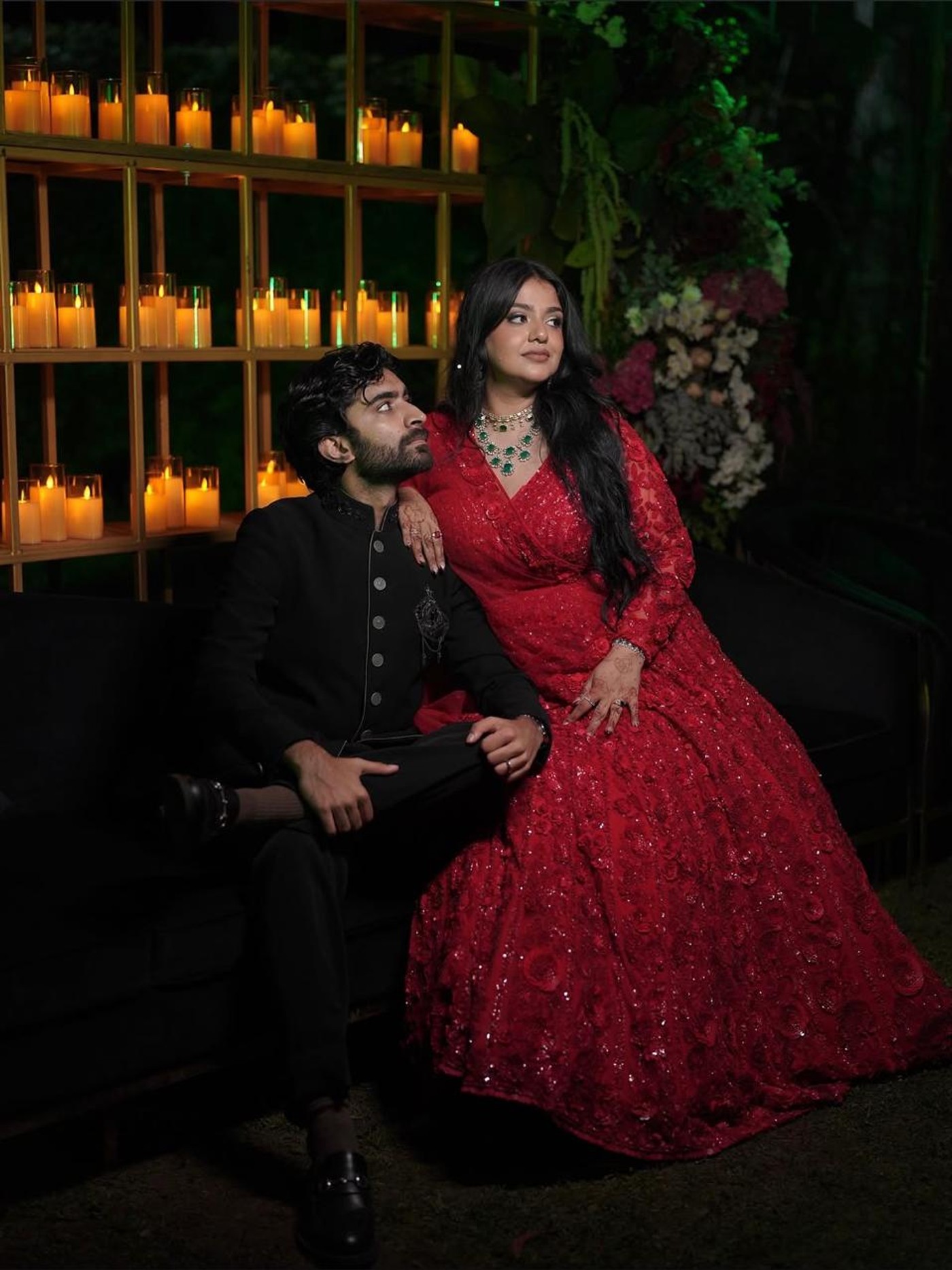
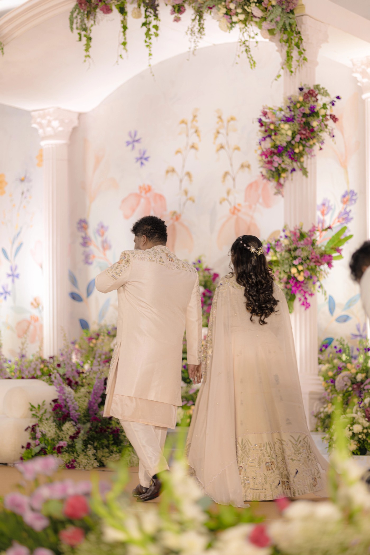
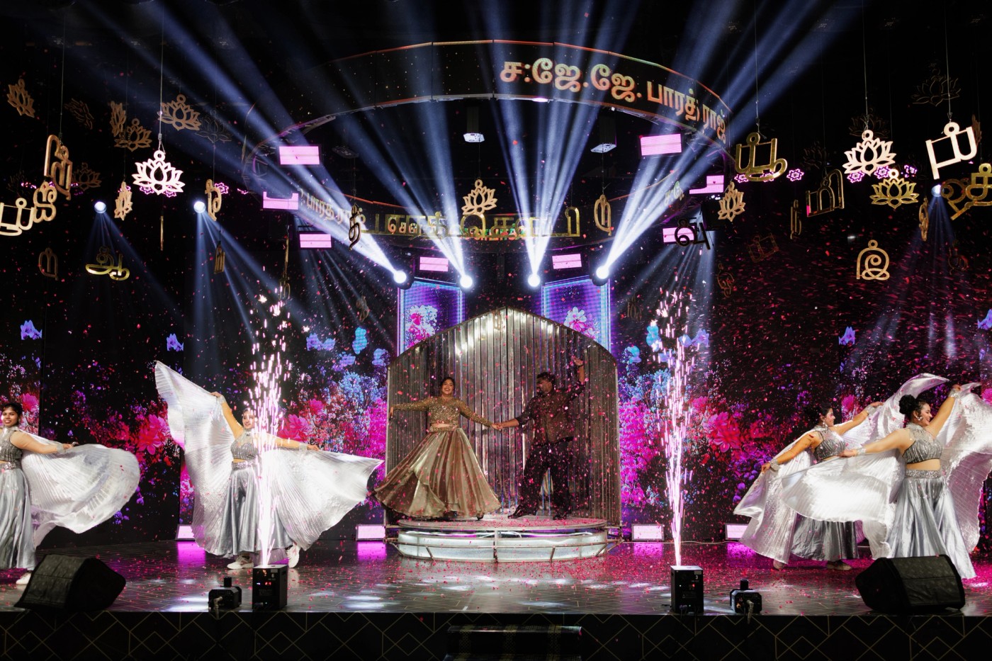
Sangeet is where deeper colours and dramatic lighting can be used effectively. Wine, plum, navy, emerald, burgundy, champagne and metallic accents can create a more glamorous atmosphere. If the outfit has extensive embroidery, the decor does not need equal amounts of detailing throughout. A sophisticated backdrop with controlled floral and lighting elements can enable the outfit to be the focal point visually.
Wedding Ceremony
For the main wedding ceremony, consider the venue where the ceremony will take place, any traditional customs/rituals that may exist within your culture/tradition and the type of ambiance you desire for your guests to experience.
Depending upon the location, ivory, red, gold, green, light pink, peach and classic floral arrangements can all work effectively. The main consideration is how the colours will appear when viewed under natural light at the venue and how they will interact with the venue's architectural style. Coordinate the Groom's Attire with the Bride's Without Making Him an Exact Replica of Her Attire The groom's attire is an integral component of the colour narrative for your wedding.
However, he does not necessarily need to wear the identical colour of the bride's attire. If the bride is wearing a multi-coloured lehenga, select one subtle shade from it and incorporate that into the groom's sherwani, stole, safa, pocket square or embroidery.
For instance, if the bride is wearing a blush, ivory and gold lehenga, she could have a groom in ivory or beige with subtle blush accents. Conversely, a deep green bridal ensemble could be paired with an ivory sherwani and a green stole or safa. Alternatively, a contrasting approach can be employed. A red bridal ensemble can be balanced with ivory or beige for the groom. A soft pastel bridal ensemble can be paired with a richer complementing shade. Increasingly, current trends in Indian wedding styling are emphasizing complementary attire for couples rather than creating matching attire for them.
Additionally, accessories and smaller details are being used to establish a link between the couple's ensembles. Do Not Forget Your Bridesmaids Your bridesmaids are also contributors to the visual narrative for your wedding.
However, their attire should support your overall colour scheme rather than competing with your attire. Rather than instructing each bridesmaid to wear the identical shade of colour as one another, consider assigning them a colour family.
For example: Bride: Dusty Rose Bridesmaids: Blush, Mauve and Muted Lavender Décor: Ivory, Blush and Sage Florals: White, Blush and Soft Greenery This allows for variety among your bridesmaids while establishing a visual connection among them.
Another option is to maintain consistency in terms of colour while permitting each bridesmaid to select a silhouette or fabric that differs from those chosen by her fellow bridesmaids. This provides a unified appearance among your bridesmaids while enabling each bridesmaid to express herself individually.
Ultimately, your floral arrangements should enhance rather than compete with your outfit. Utilizing floral arrangements to enhance your outfit is especially pertinent when your outfit features floral embroidery or elaborate patterns. Pairing a heavily detailed outfit with an equally detailed floral backdrop can produce an excessive amount of visual information in photographs.
Day Wedding or Night Wedding
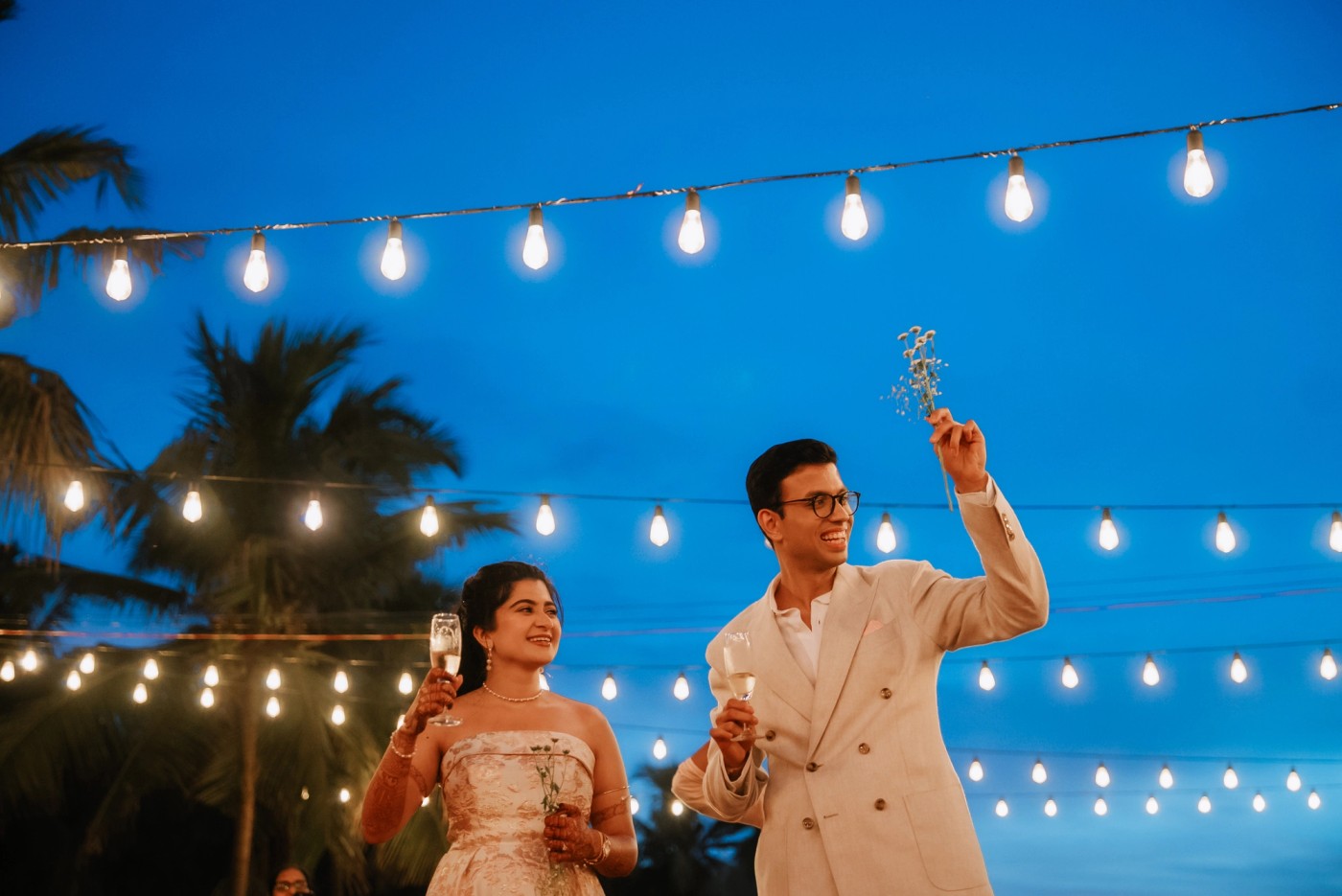
Lighting affects everything. Additionally, the time of day during which your celebration occurs should influence your colour selections. Soft pastel colours; peach; powder blue; blush tones; and light greens can be effective during daylight hours. Conversely, richer colours such as emerald; wine; navy; plum; and deeper metallic accents can generate greater visual depth during evening celebrations.
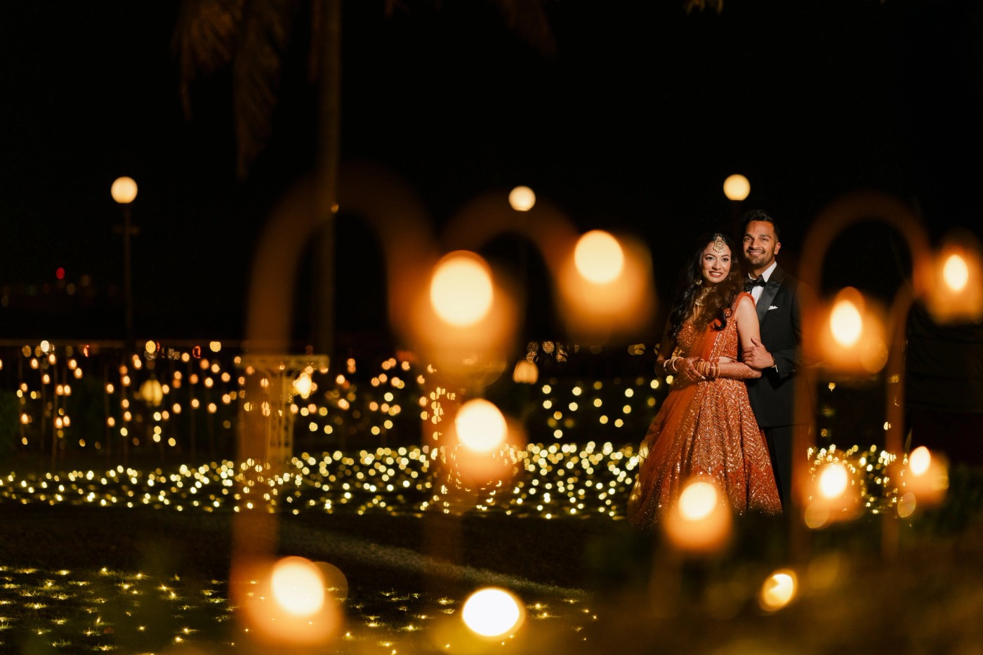
However, do not select colours solely based on how they appear under natural light conditions. Stage lighting; photography lighting; and ambient lighting at your venue can alter how colours appear in photographs. Lighter-toned palettes may disappear against a pale backdrop while extremely dark backdrops can negatively impact the brightness and clarity of couple portraits.
Herein lies where a professional design and production team can assist in translating a mood-board colour into something that functions effectively on your wedding day.
Got clarity? Have a happy & vibrant wedding!
